Flipboard 2.0 FTW!

So here I am, day three of Spring Break, lounging on the beach in Oman with nothing but unreliable wifi and my phone to keep my mind active.  I am embarrassed to admit it, but my fingers have been trying to engage the phantom limb of my laptop since I arrived.  Today started with a bleak outlook.  Our snorkeling trip was cancelled due to choppy seas, and I forgot to charge my phone last night.  As a result, my phone kept interrupting a saucy tale (read on my iPhone Kindle app) of cyber-espionage and Saudi oil intrigue with regularity warning me of its impending death.  It was then that my  beloved Flipboard, announced its newest upgrade, Flipboard 2.0.  In the wake of the news of Google Reader's demise, this definitely takes away some of the sting.  The new and improved Flipboard 2.0 has a bookmarking function that allows you to create and share your own magazines.  It also allows you to bookmark items from... wait for it... browsers on YOUR COMPUTER, iPad or iPhone with Android soon to follow! They have also improved their discovery tools and connectivity with social networking sites and RSS by including hashtags, expanding searches, and allowing you to like, share, and comment directly back to the sites from Flipboard. 

Why is this great news?   I have always been a big fan of Flipboard.  I typically use it to browse through my Twitter feed when I am on the go or away from my computer.  Let's face it, the magazine layout is just so much more engaging and easier on the eyes, and it is quick and efficient.  ​While this allows me the mobility that I crave, a Twitter stream is still a Twitter stream.  Now you see it now you don't.  If I find something that is a keeper or that I want to save to read later, I still have to store it somewhere and bookmark it.  Before today, this required me to send the links to myself via e-mail or to Instapaper for later bookmarking on Pinboard. 

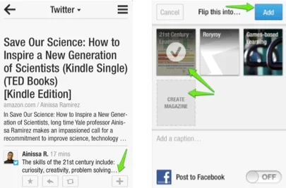
Now it is as easy as clicking on the '+' sign found in the bottom right hand corner of the screen.  ​Then you either create a new magazine or add the link to one that you have already created and click Add!  Voila!   

Screenshot 3:27:13 4:09 PM.jpeg

So now what?  Well for starters you can share your magazine with other users of Flipboard, via e-mail or the other social media sites connected to Flipboard.​  Try it out.  Using a device that has Flipboard, click on this link to the 21st Century Learning magazine that I created this morning.  You can find your magazines under "My Flipboard" by clicking on the Flipboard "flag" (or three black lines in the upper right hand corner) from any screen.  If you create a magazine you will find it in the "My Magazines" section, otherwise you will find them under "My Subscriptions". 

Once you have created a magazine, you can add to the magazine from any device as long as you have installed the bookmarklet to your browser.  Just open this link in the browser that you plan to use for bookmarking and follow the simple directions.  This will work for safari on iPhones and iPads as well.  When you click on the Flip it button on your tool bar, it will open a pop-up window like this: 

Screenshot 3:27:13 2:21 PM.jpeg

Just put it where you want and you will find it in the designated Flipboard magazine the next time you open it up in the order that the links were added to the magazine with the most recent post first.  ​Note that you can also create magazines from your computer browser as long as you have the bookmarklet. 

Though these are some exciting developments, Flipboard is still not THE answer for all of my networking and bookmarking needs.  Having said that, these are exciting developments and hopefully 3.0 is not far behind!  Flipboard R&D if you are reading this, take notes!  I am hopeful that the next release will include a web version, and more organizational control over the content.  I would also like to see collaborative contributions to these magazines.  I am happy to share what I curate from my Twitter feed with others, but it would be great if the readers could become collaborators and contribute their great finds as well!   ​

Alas, this is as far as I have made it with my exploration.  I am on vacation after all, my phone is charged up and my spy novel beckons!  Be sure to check out this article for more information, and let me know if you discover any other hidden jewels. Back to idle "bliss"!

A Shout Out to Awesomeness

About 13 years ago, I met a fellow biology teacher, Alfred Olivas, while working at Escuela Campo Alegre.  We were introduced by a mutual friend at a conference shortly after I started working in Caracas. He worked in Valencia at the time so he shamelessly started using me for a place to stay when he came to the big city.  Luckily I didn't hold it against him that he used more hair product than I did and it took him  twice as long to get ready.  I guess the fact that he was a fellow Texan helped his cause a little.  Our paths crossed again a few years later in Shanghai where he is still teaching today.  Thirteen years later, we are still in touch and after what he shared with me today, I am so glad that we are.  Allow me to introduce Alfred in all of his awesomeness with his SAS -SY productions movie trailer for his incredibly adventurous unit on weather and climate:

I totally want to be in his class!  Oh to be a 6th grader again!   Imagine what the full length film would involve!  Before each unit, Alfred and his partner teacher, Lisa Fung-Kee-Fung, create these unit trailers using iMovie '11 to amp up the anticipation of their students for the new material.  As soon as he shared this, I immediately went to check it out. I was even more excited to read in a post from Mac Life, "You’ll be pleased to know that you don’t actually need to think too much about this: iMovie ’11 comes with its own trailer-making factory. Just add the clips in place, type in some information, and you’re good to go."  There are 15 different types of ready made themes complete with music and all.  Check out the instructions on how to make a trailer at this link

The possibilities for this sort of technology are endless.  One application would be that students could create summaries of their learning using this movie trailer format. Another possibility would be to propose this as an option for students to introduce their designs for my "Save Earth" competition in Physics.  I am definitely adding this to the plan.  This would also be a great project for students preparing for their Week Without Walls trips as their is a significant amount of preparation and planning that occurs prior to the experience.  I CAN'T wait to start experimenting with this tool.  In fact, I am going to cut this post short. 

Dear Fredo,​

 I am currently accepting applications for my science teacher crush of 2013-2014.  There is some tough competition out there, but you have jumped up to the top of my list.  Keep those amazingly creative ideas coming.  Oh, and just out of curiosity, when do you think you will manage to make your way to India so that we can actually work together in the same department?  I would even be willing to let you use my hair dryer from time to time, if you promised to share some of your awesomeness! 

P.S.  If you want to learn more about what Alfred is doing in science, you can check out his site or just send him an e-mail.  

P.S.S.  If you can think of any way to enhance learning in your classroom using movie trailers please share in the comments session.  This is just too fun to pass up! ​

DIY PD Part 1: Design Thinking and the Demise of Google Reader

Last week, our Director of Research and Development sent out an e-mail about an upcoming professional development opportunity.  Our school is planning to send a team to a conference this summer, and interested parties were invited to apply to be a member of the team. The topic:  Design Thinking.  Now this is something that I have been interested in for a while.  Unfortunately, I am already presenting at two conferences this summer bookending a family reunion around the same time, so I am unable to attend.  Now I am not one to miss out on anything, so after thinking about it for a while, I decided to challenge myself to learn more about Design Thinking on my own by August than I would be able to were I to attend the conference in July. 

I came up with a great plan (or so I thought)!  All I needed were the following tools:  

  1. Twitter and a "pretty" way to read and capture content (Flipboard/Instapaper)
  2. Pinboard (or another bookmarking tool)
  3. Google  Reader ... and a "pretty" way to read and bookmark content (Feedly, Caffeinated, etc.)
Screenshot 3:16:13 7:25 PM.jpeg

​I was going to farm my information from three main sources.  First, my Twitter feed.  I am currently following around 300 people, most of whom post frequently about education reform, innovation, edtech, and/or research in science.  I typically devote about an half and hour to an hour a day flipping through my feed using the Flipboard app on my phone and iPad.  The plan: save all articles dealing with Design Thinking to Instapaper, or bookmark it on Pinboard with the tag designthinking.  I can also tag all of the articles saved on Instapaper, as all unread items feed into my Pinboard.  

Since I miss more articles than I can get my hands on with Twitter, I created an RSS feed for the hashtag #designthinking and subscribed to it in Google Reader. To do this all you have to do is enter this code as your feed URL: 

http://search.twitter.com/search.rss?q=%23YourSearch

and replace YourSearch with the term (no hashtag).  All of this can be saved for a day when I have devoted time to learning about design thinking.  ​

My second source is Pinboard.   I will use this to read through all of the articles that I have personally tagged with designthinking from all of my sources (Instapaper, Google Reader blogs, Twitter).  I can also search for the tag designthinking in resources that other users of Pinboard have tagged. To manage this, I created an RSS feed for the tag designthinking that I added to my third source, Google Reader, so I don't have to actively search for this tag, it just comes to me.  To create the RSS you simply replace the word tag in this code with the tag you desire: 

http://feeds.pinboard.in/rss/t:tag/

Google Reader is the source that ties it all together.  A triangulation of everything really.  I can subscribe to blogs and resources about design thinking.  I can also look through articles that have been tagged with designthinking via ​the RSS feeds I created from Pinboard and Twitter. 

As you can see, these three main tools that I plan to use are completely interconnected.  It might sound complicated, but with a little juggling practice, the management of it becomes rote. In the end, I am able to capture and store information from an infinite number of sources, most of which I will be encountering for the first time when I finally sit down to digest the information that I have bookmarked and saved.   

Then one morning while flipping through my Twitter feed, I heard the bad news.  ​

The initial reactions of people across the globe were not promising.  Almost immediately, the subtitles for the famous scene from the German war film, Downfall, ​when Hitler realizes that he has lost the war were rewritten to reflect "Hitler's"  reaction to the death of Google Reader. 

His advisers tell him that Google is killing Reader: 

"Anyone who thinks social media is a valid replacement for an RSS reader, leave the room now." (If you are undecided, check out this post about Twitter as an RSS alternative.)

As he begins his rant, Hitler follows this up  with a few choice quotes, including:
"How dare they take away Google Reader, I have over 300 feeds in there! "
"Do they have any idea how much effort went in to collect my feeds?​" 
(And several other unmentionables ones :-)

I must admit, I certainly identified with these sentiments initially.  Removing any one of my carefully interwoven sources would surely mean complete failure of the system that I had developed.  However, after reading a few posts from bloggers (that I follow on Google Reader :-), and taking a closer look at the links in my system, I realized that I had doubled back on my three main resources to allow me the mobile flexibility that I desired.  Essentially I had covered all of my bases.  I then arrived at the conclusion that ​with minimal effort on my part, the transition will most likely be seamless. 

Fact:  Several third party RSS feed readers prophesied the end of Google Reader, and have already cloned the Google Reader API.  Feedly, a free RSS reader, did just that. Check out this post about their development in preparation for the transition.  As you can probably tell, I like to cover my bases.  So this morning, in less than 10 minutes I signed up for a free account and transfer all of my feeds from Google Reader to Feedly (just in case Caffeinated doesn't pull through by July 1st).  I have to admit I  like the interface a little better than the one for Caffeinated.  The one major drawback for me is that I can't directly tag posts and bookmark them in Pinboard, which is something that I can do with Caffeinated.  If this is not an issue for you, you should check out Feedly. 

Regardless, I now realize that although Google Reader is going to disappear, my RSS feeds will not.  The API will just live on in a more aesthetically pleasing form like Normandy.

Screenshot 3:16:13 6:12 PM.jpeg

Now that the Google Reader is stepping aside, I am hopeful that both Feedly and Caffeinated with evolve to include the improvements that I am looking for in a reader by July 1st, and my biggest dilemma will be which one to choose!

For a positive spin on this period of transition, you might want to follow Marco Arment's blog.​  He has written several posts about RSS feeds and readers since the news broke.  I would also recommend listening to his recent podcast called Negativity, Skepticism, and Doubt, as it was very informative. 

As for me, I am going to get back to building my collection on Design Thinking.  ​I can rest easy knowing that my system won't break down any time soon. 

IB Exam Review with Image Quiz

While scanning through some new tools posted on the blog Educational Technology and Mobile Learning by Med Kharbach, I came across this new online quiz create called Image Quiz.  This tool allows you to post images and quiz students on structures and functions.  Though it is still in its beta form, this tool has some great potential. 

In IB Biology, the list of structure-function diagrams that students are required to know is quite extensive.  My seniors will be finishing their syllabus in the next couple of classes, and then the intensive two-year review begins as they prepare for their exams in May.  During review, I typically provide my students with a list of diagrams that they need to be able to draw and annotate with the respective functions of different structures.  This year I am thinking of incorporating this tool into this review process. 

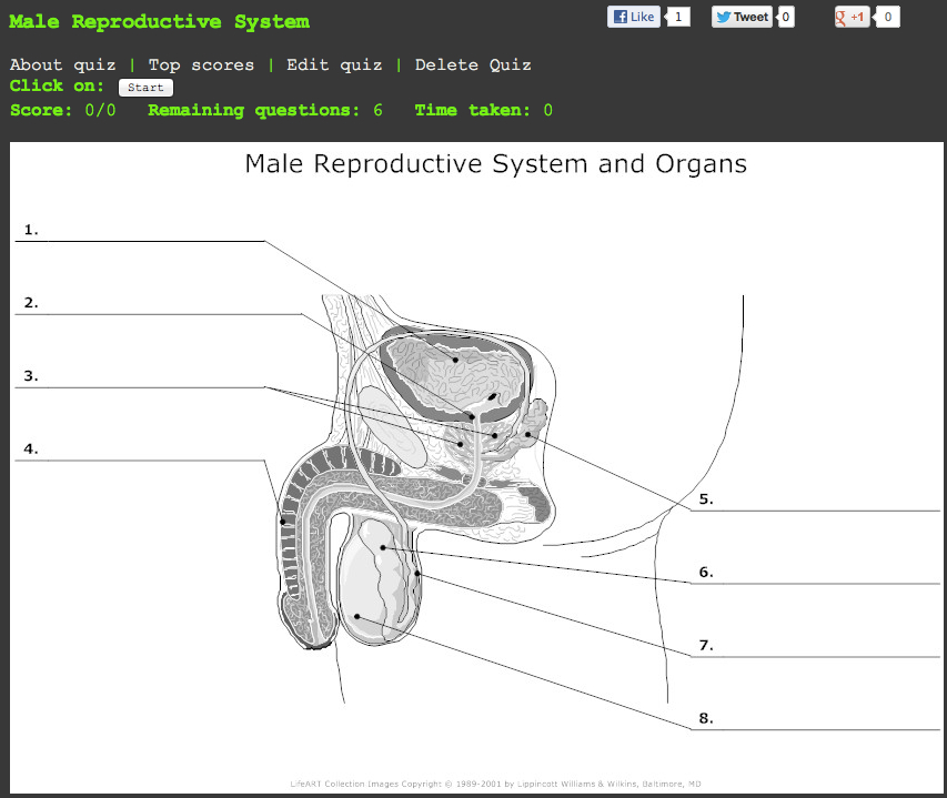
For my purposes, I can see two key applications of Image quiz.  The first is the simple labeling of structures.  Below is one that I made for the male reproductive system.  ​

You can click through on the image to take the quiz.  This is one type of question that students might get on a Paper 1 exam in biology.  ​

The second is quiz to test their knowledge of the functions of different structures.  The plant diagram at the top of this post is an example of this type of quiz.  Again you can click on the image to take the quiz.  ​

So this is how it works.  You need to first select an image that you want to use for the quiz.  You can either use a image URL or a file from your computer. 

​You then fill out the fields on the screen above and go to create quiz.  On the next screen, you outline the areas of the image that you want the students to click on and then you enter your descriptor. 

Screenshot 3:9:13 12:25 PM.jpeg

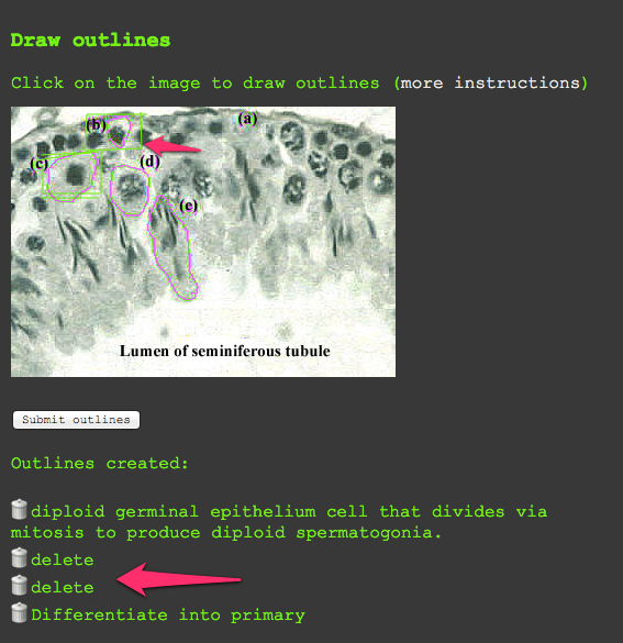
For example, in the image above, I would outline the germinal epithelium cell identified in the micrograph by drawing a box around the area in green.  When I complete the box, I double click and a text box appears.  Depending on what I want the students to do, I would either enter the name of the cell or I could write the function of the cell.  You then click submit and then continue to outline structures.  When you finish, you click submit outlines, and the quiz is ready to go. 

As I mentioned before, this is still in its beta form, so I have a few tips on how to avoid some of the issues that I encountered.  ​

  1. ​Be sure to select an image that is large enough for outlining.  Once you submit your title and image etc. you can't go back and change it for that quiz.  You will have to start from scratch.  A couple of times I used an image online that was too small once I moved to the outlining page.  If this happens, just submit the outlines and then you will have the opportunity to delete the quiz. 
  2. When selecting an image, be sure that you select one that has the area indicated with either an arrow or letter etc. if there are multiple areas on an image that they could select.  If you look at the leaf quiz that I created, there are several areas on the screen that could be selected for the palisade mesophyll.  Since I cannot select multiple areas for one question, I indicated the areas that they were to choose from to turn it into more of a matching exercise.  ​This of course is not necessary if you there is only one possible area to select. 
  3. If you don't find an image that fits these specification, you can always use a image editing tool to create the image that you want as you can upload images from your computer. Skitch is a handy online tool for this purpose.  ​
  4. Be sure to plan out how you want them to indicate their answers on your picture and include those instructions in your description.  As long as you are logged in, you can edit the quiz after completing it.  When it takes you to quiz mode, you will find both the edit and delete buttons.  Here you can revise your instructions if additional instructions are needed.   ​If you do make edits, this program will save it as a new quiz, so you want to delete older versions.  These can be found under the "my submissions" tab.
  5. The outlining is pretty easy, but occasionally you make mistakes in your outline or it submits before you are finished due to a clicking error.  If this happens, I just enter the word delete in the text box, and then when I finish my outlining, I delete all of these outlines by clicking the trash can image (see above).  ​

​I have emailed the developer about these issues, so hopefully these will not be a problem once it is out of beta.  Regardless this is an easy tool to use for both teachers and students.  As part of my review, I am going to have students signup to create quizzes for each of the required diagrams in the syllabus.  When I finish putting this together, I will post the assignment under the IB Biology lessons tab.  For those of you teaching online classes or using blended learning in the classroom, this would be a great way for students to assess their understanding as they navigate the material.  This would also be great for foreign language teachers for connecting vocabulary with images in scenes.

If you know of an alternative tool that I could use, I would love to hear about it.  ​

Update:  The developer wrote me back within a couple of hours.  He was very helpful with answering my questions.  If you run into any issues, you can contact him at:  simon@imagequiz.co.uk